Case study
Sales Performance
Dashboard
A Power BI dashboard tracking revenue over time and across regions, built to support fast, data-driven business decisions.
01 · Overview
The question
Revenue totals alone don't tell a sales team much without context. Is revenue trending up or down, and is performance even across the business's regions? This dashboard was built to answer both questions in one place using Power BI.
The approach
Revenue was modeled on a monthly time hierarchy to support a clean trend view, then broken out by region to compare performance across the business's four operating areas. Together, the two views separate how revenue is moving over time from where revenue is coming from, two questions that get muddled if you only build one chart.
02 · Revenue trend
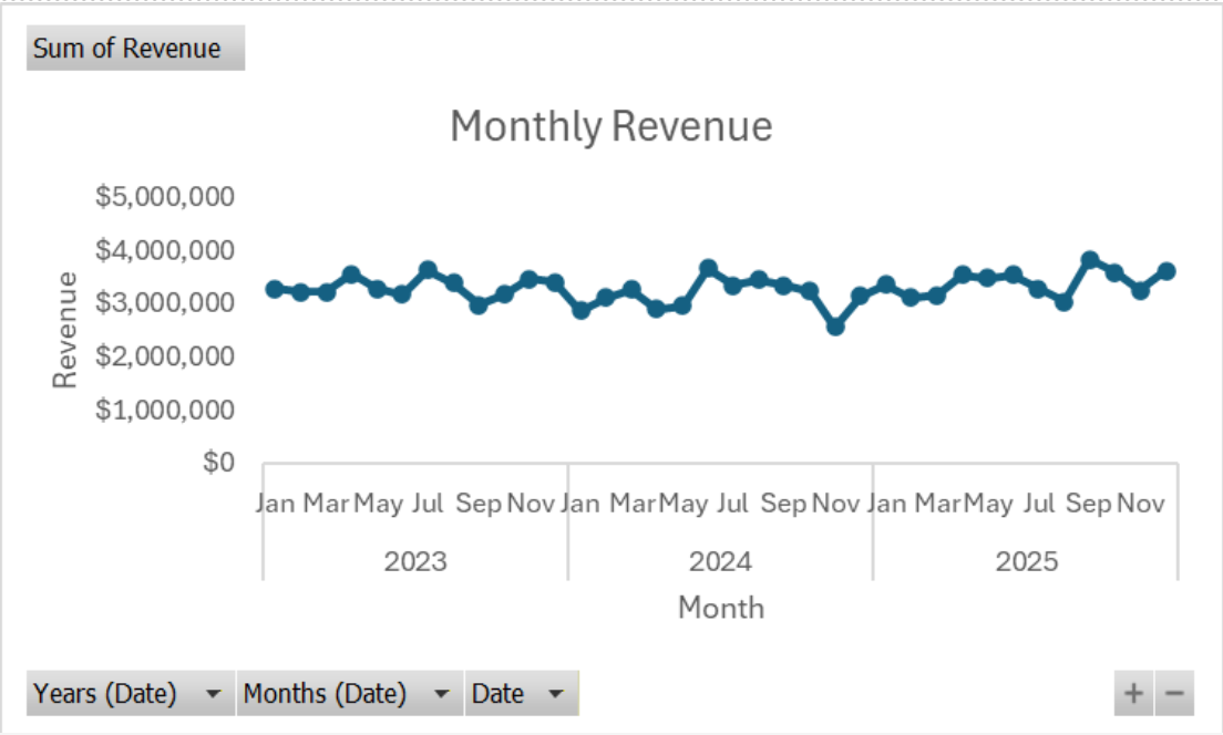
Monthly revenue holds a consistent, seasonal rhythm across the three years shown, cycling between roughly $2.5M and $3.8M with no sustained upward or downward trend. That's a useful finding on its own. It tells management that revenue swings are seasonal and recurring rather than a signal of decline, which changes how those dips should be planned for.
03 · Regional performance
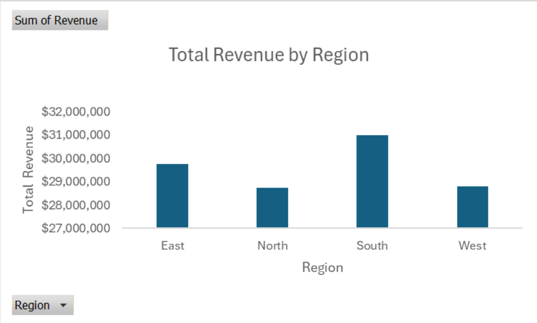
Breaking total revenue out by region shows the South leading at roughly $31M, with the East close behind and the North and West trailing at a similar level to each other. The gap between the top and bottom region is narrow enough that no single region is carrying the business, which points toward incremental, region-specific tactics rather than a wholesale strategy shift.
04 · Outcome
Together, the time and regional views give management a fast read on both dimensions of sales performance, whether revenue is moving because of seasonality or something more structural, and whether that performance is spread evenly across the business or concentrated in one place.