Case study
Marketing KPI
Dashboard
An interactive Tableau dashboard comparing campaign conversion performance across marketing channels and channel types.
01 · Overview
The question
A marketing dataset spanning dozens of campaigns across six channels, Email, Print, Radio, Search, Social, and TV, raises two practical questions for a manager. Which individual campaigns are converting best, and which broader channel groupings are actually driving those conversions?
The approach
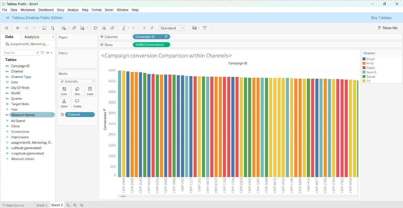
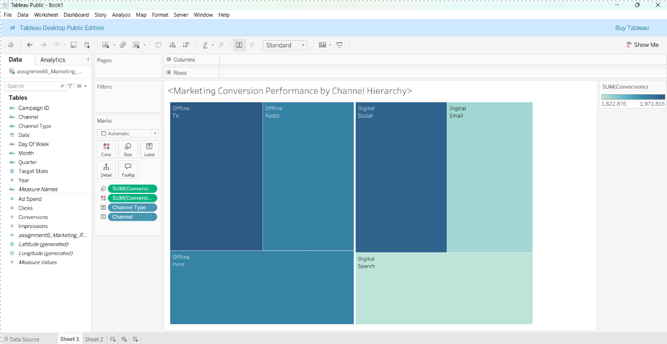
I built two complementary views in Tableau. A campaign-level bar chart colored by channel, for spotting individual over- and under-performers, and a treemap grouping conversions by channel hierarchy (Digital vs. Offline, then by specific channel), for seeing the bigger allocation picture at a glance.
02 · Campaign-level comparison
Coloring each campaign bar by its channel makes it possible to scan dozens of campaigns at once and see whether high performers cluster in a particular channel or are spread evenly, a pattern that's invisible in a flat table of campaign IDs and conversion counts.
03 · Channel hierarchy view
Rolling conversions up into a Digital vs. Offline hierarchy shows Digital channels, particularly Email and Social, holding the largest blocks of conversions, with Offline channels like TV and Radio contributing meaningfully but at a smaller scale. This is the view built for a budget conversation. It shows where conversions are concentrated without losing the individual-campaign detail available in the chart above.
04 · Outcome
Pairing a granular campaign-level chart with a rolled-up hierarchy view lets a manager move between two levels of decision-making, which specific campaigns to optimize or cut, and which broader channels deserve more budget, without needing two separate reports.