Case study
AI-Assisted IT
Operations Visualization
A Tableau dashboard analyzing monthly IT ticket volume, using an AI-assisted workflow to speed up chart iteration and flag the months worth a closer look.
01 · Overview
The question
IT ticket volume is easy to track but hard to read month to month. A raw count doesn't tell you whether a given month was actually unusual. The goal was a single view that lets an operations manager see monthly ticket volume against a baseline at a glance, rather than scanning a table of numbers.
The approach
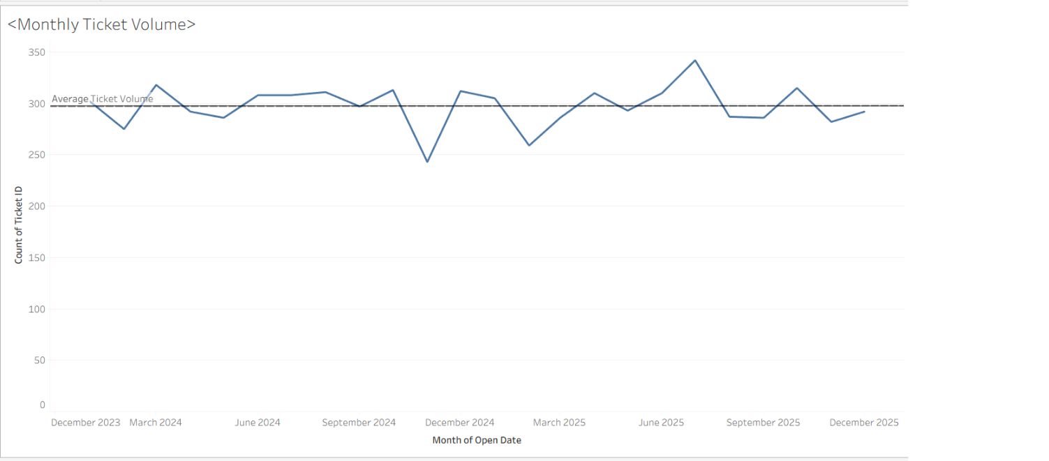
Ticket data was aggregated by month in Tableau and plotted as a line against a reference line for the average ticket volume across the full period. I used a generative AI tool alongside Tableau to speed up early exploration, testing chart types, checking that the reference-line approach was the clearest way to show deviation, and sanity-checking the resulting trend before finalizing the visualization.
02 · The dashboard
Plotting monthly ticket counts against the average line immediately separates ordinary month-to-month noise from real spikes and dips. The chart shows ticket volume holding close to its ~300-ticket average for most of the period, with two clear departures, a sharp drop in December 2024 and a pronounced spike around June 2025, the two points an operations team would want to investigate first.
03 · Outcome
A single reference line turns a routine ticket-volume chart into a screening tool. Instead of asking "was this a normal month," the manager just looks at which points fall away from the line. It's a small design choice, but it's the difference between a chart that reports data and one that actually flags where to look next.