Case study · Group capstone
Airline Operations
Performance Analysis
A seven-visualization Tableau analysis of airline flight volume, delays, on-time performance, seasonality, and geography, built for BAN 650, Data Visualization for Managers, progressing from foundational comparisons to multivariate and geospatial views.
01 · Overview
The brief
Using a class airline flight dataset covering five carriers and sixteen origin airports, our team was asked to help managers understand patterns in flight activity, delays, and cancellations through data visualization, starting with foundational comparisons, then layering in distribution, time, geography, and multivariate views to add context a single chart couldn't provide.
My role
Working within a seven-person team, I contributed to the foundational and distribution analysis and took the lead on the geospatial and multivariate sections, including identifying the color-scaling issue described in Section 06 below, which became a key ethical finding in our final narrative.
02 · Foundational analysis, flight volume
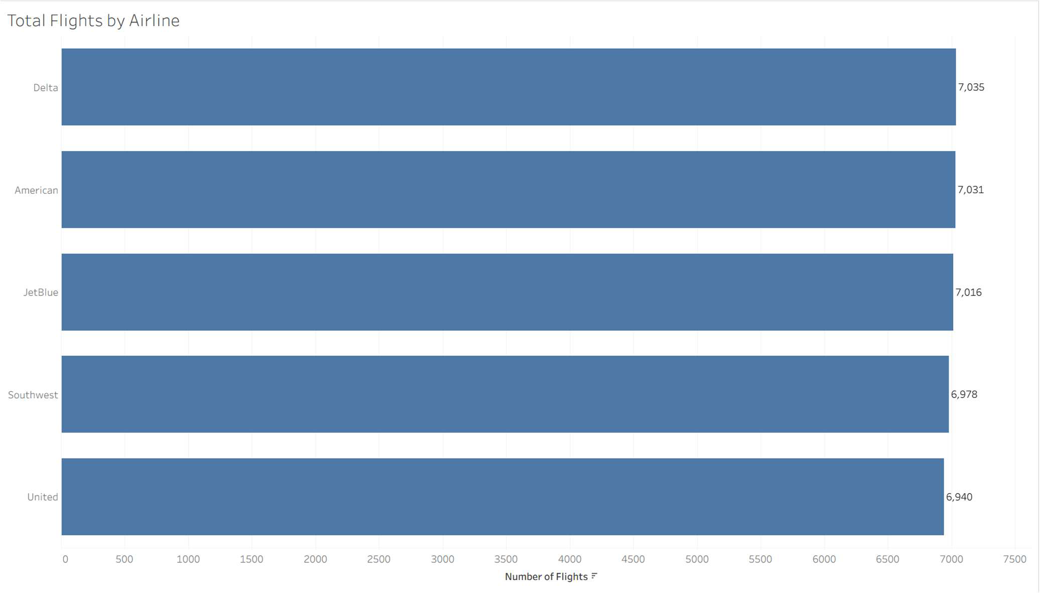
A bar chart comparing total flights per airline was the natural starting point, since it lets managers compare volume across categories at a glance. The dataset turned out to be remarkably balanced. Delta leads with 7,035 flights and United trails with 6,940, a gap of under 2%. That balance matters for everything that follows, since it means later differences in delay or on-time performance can't be explained away by one airline simply flying more.
03 · Delay & on-time comparison
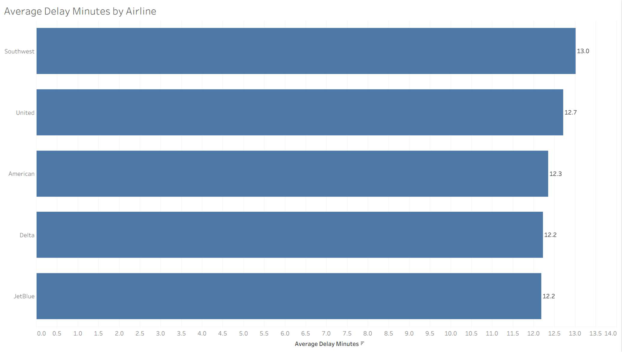
With volume established as balanced, average delay minutes became the more meaningful performance measure. Southwest showed the weakest average delay (13.0 minutes) while JetBlue performed best (12.2), with the field otherwise clustered closely, a ranking that doesn't track with flight volume at all, confirming that delay differences reflect something other than scale.
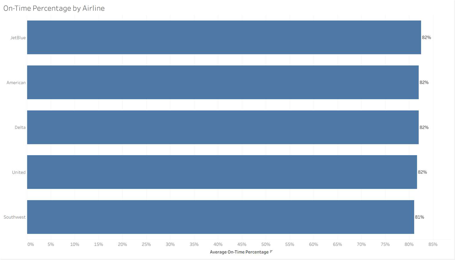
A companion on-time percentage chart added a second, standardized reliability measure. Four of the five airlines tied at 82% on-time, with Southwest again the outlier at 81%.
04 · Distribution view
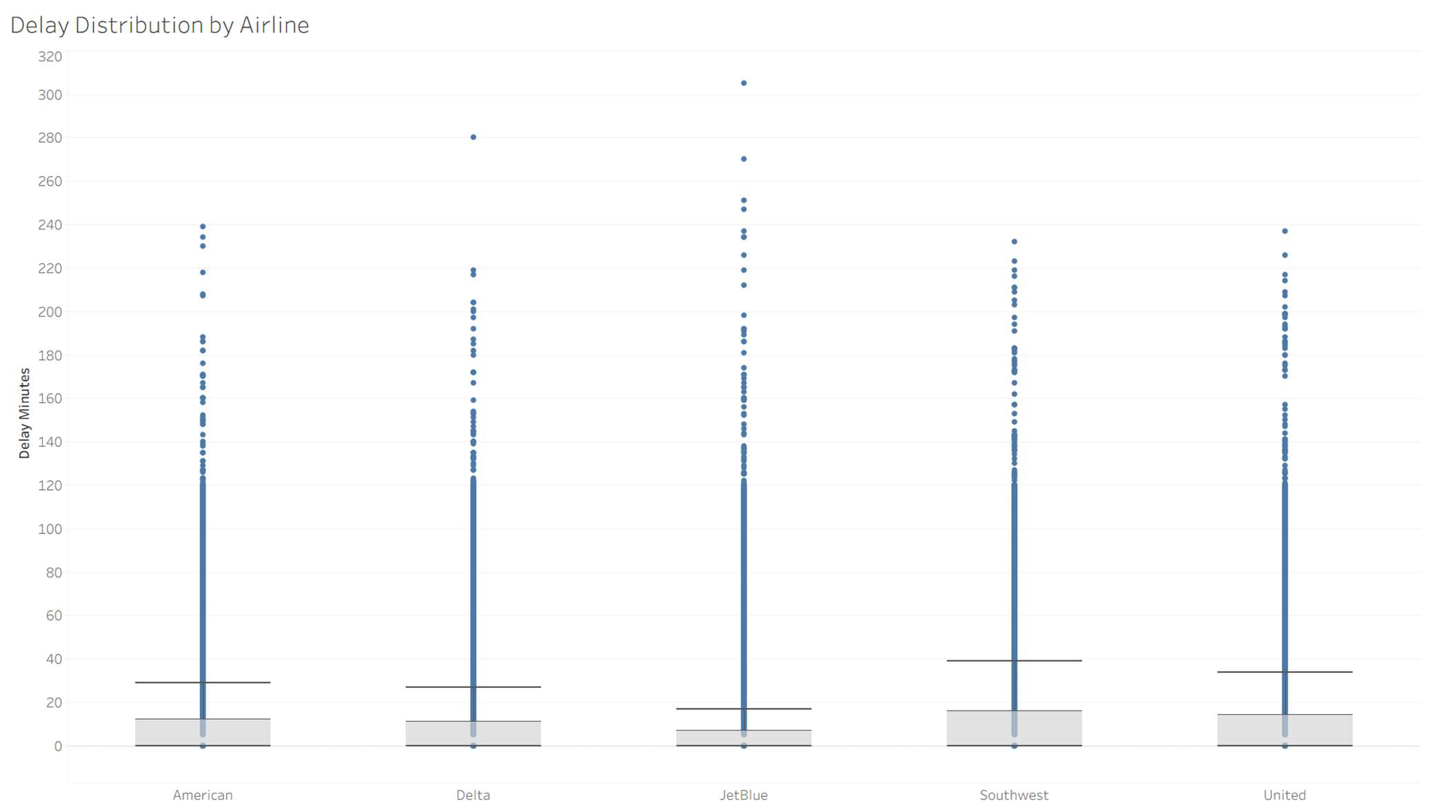
Averages can hide as much as they reveal, so we added a distribution chart showing every flight's delay by airline. The result is a right-skewed pattern across all five carriers, where most flights run close to on-time, but each airline has a long tail of extreme outliers running past 200 minutes. Airlines with similar averages can still carry very different amounts of this tail risk, which is exactly the kind of operational instability a mean value alone would mask.
05 · Temporal analysis
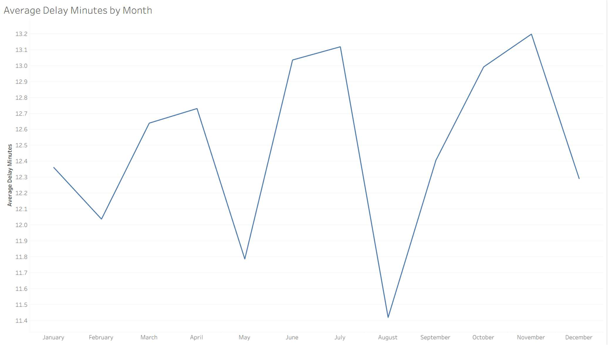
Plotting average delay by month across the full year surfaces a seasonal, cyclical pattern rather than a steady trend. Delays climb through the summer and again in the late fall, with a sharp dip around August. That pattern points management toward targeted fixes (scheduling buffers, added staffing during peak months) rather than a system-wide response, since the data shows a recurring operational challenge rather than a permanent decline.
06 · Geospatial analysis
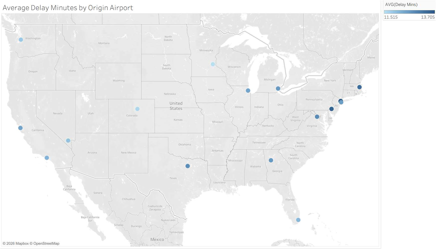
Mapping average delay by origin airport shows a mild east-leaning pattern, with the three highest-delay airports (LGA, PHL, BOS) all sitting on the Northeast corridor. But the actual spread across all sixteen airports is only 2.2 minutes, from 11.5 at MSP to 13.7 at LGA.
That narrow range was the central ethical finding of this section. Tableau's default color scale stretches that 2.2-minute spread across its full palette, making the geographic pattern look far more dramatic than the underlying numbers support. Presented at face value, the map invites a manager to over-trust the visual ranking, a good example of why chart defaults need to be checked against the actual magnitudes before they inform a decision.
07 · Multivariate analysis
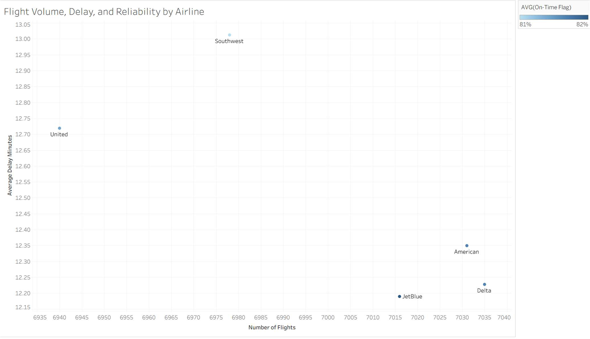
A final scatter plot combined flight volume, average delay, and on-time percentage in one view to test whether higher volume drives worse performance. It doesn't. Delta, American, and JetBlue cluster together with high volume and low delay, while Southwest stands apart with noticeably higher delay at a comparable volume. As with the geography view, the x-axis compression is worth flagging, since the real spread in flight volume across all five airlines is less than 2%, even though the chart's default scaling can make it look larger.
08 · Outcome & ethical considerations
The seven visualizations build in a deliberate sequence, moving from balanced baseline comparisons to distribution, time, geography, and multivariate trade-offs, so that management comes away understanding not just which airlines perform better or worse, but where averages and default chart scaling might be masking or exaggerating the real variation underneath.
The project's clearest takeaway was ethical rather than statistical. Both the geographic map and the multivariate scatter plot used auto-scaled axes that made small, real differences look dramatic. Flagging that limitation directly in the report, rather than letting the default visual speak for itself, was central to presenting the analysis responsibly.